AI Images With Text: Make Social Posts Readable
How to put text on AI and photo posts so it reads on a phone: word limits, contrast ratios, safe zones per format, spelling checks and what never to invent.
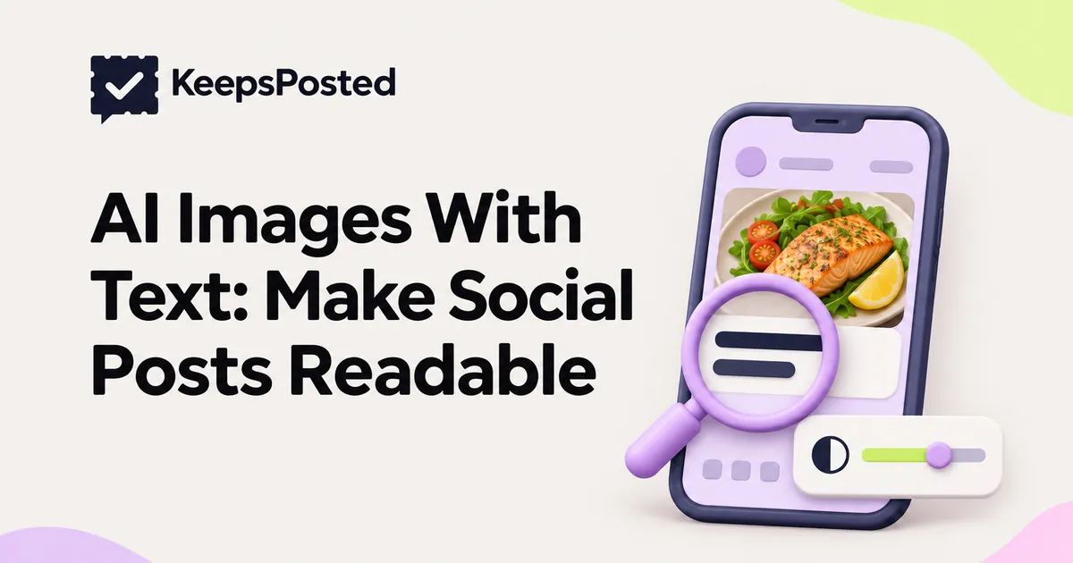
Text on a social image has about a second to work, on a screen a few inches wide, often over a busy photo. Most unreadable posts fail for one of four reasons: too many words, too little contrast, text under the app's buttons, or letters that an AI image model got wrong.
Start with the numbers below, then use the annotated checklist at the end on every post that has words on the image.
The numbers to keep in mind
| Check | Limit | Where it comes from |
|---|---|---|
| Headline length | 3 to 7 words | Our rule of thumb for a one-second read |
| All words on the image | About 20 at most, fewer is better | Our rule of thumb; the caption carries the rest |
| Contrast, normal text | At least 4.5:1 | WCAG 2.2, success criterion 1.4.3 |
| Contrast, large text | At least 3:1 | WCAG 2.2 (large means at least 18 point, or 14 point bold) |
| Reels and other 9:16 video | Keep text out of the top 14%, bottom 35% and 6% each side | Meta's ads guide for Instagram Reels; a cautious rule for organic posts too |
| Instagram profile grid | Keep text inside a centered 3:4 area | Widely reported grid change in 2025; check the app's preview |
The Web Content Accessibility Guidelines (WCAG) are written for websites, not social posts. They are still the best published yardstick for readable text, and WCAG says its contrast rules also apply to images of text.
Why AI image models misspell words
Ask an image model for "a poster that says Pumpkin Loaf $4.50" and you may get "Pumkin Laof $4.5O". Researchers at Google found one reason: many text-to-image models read prompts as chunks of words rather than individual letters, so they struggle to draw a word as a sequence of characters. In their tests, character-aware models spelled far better, especially on rare words (Liu and others, "Character-Aware Models Improve Visual Text Rendering", 2022). Newer models are better, but a model that draws letters as pictures can still draw them wrong.
The fix is to separate the two jobs. Let the photo or the AI background be the picture. Set the words on top with a design tool or text renderer that types real characters, so "$4.50" is exactly what you typed. That is how KeepsPosted does it: the text is set by a renderer on your own photo, or on an AI background that is labelled as AI, not drawn by the image model.
How much text fits on a phone
A feed post designed at 1,080 pixels wide is shown at well under half that width on most phones. For example, if a phone shows the post about 400 points wide, everything shrinks to roughly 37%. Text 60 pixels tall on your canvas ends up about 22 points tall on screen, which is close to the size WCAG treats as large text. Text 30 pixels tall ends up about 11 points: small print.
- Headline: 3 to 7 words, set large. On a 1,080-pixel-wide canvas, our working minimum is about 60 pixels letter height for the headline and about 40 pixels for a supporting line.
- One supporting line: a price, a date, or a place. Not a sentence about how delicious it is.
- Numbers as digits: "$4.50", "Sat 21 Nov", "5 to 7 p.m." are faster to read than words.
- One message per image. If you need two messages, use two slides in a carousel.
- Everything else goes in the caption and alt text. Alt text should repeat the words on the image for screen-reader users; see the alt text section of our photo guide.
Check on a real phone, at arm's length, before you post. If you have to bring the phone closer, the text is too small or too long.
Contrast: text over photos
Contrast ratio compares the lightness of the text and what is behind it. WCAG 2.2 asks for at least 4.5:1 for normal text and 3:1 for large text. Black on white is 21:1. Mid-grey text on a mid-tone photo can drop well below 3:1.
Find the busiest part of the photo under the text
A photo is not one color. Check the lightest or darkest patch behind the letters, not the average.
Measure it
Pick the text color and that background color with any color picker and put them into a free contrast checker. Aim for 4.5:1 even for headlines; it leaves room for phone glare.
If it fails, add a panel, not a shadow
A solid or semi-opaque band behind the text fixes contrast reliably. A thin drop shadow rarely does.
Move the text before you darken the photo
Most food, room and product photos have a calm area: table, wall, sky. Put the text there and keep the subject clean.
Safe zones by format
Each format crops the image or covers part of it with buttons, captions and profile names. Keep text out of those areas.
| Format | Shape | Keep text out of | Confidence |
|---|---|---|---|
| Instagram feed | 4:5 portrait | The top and bottom strips that the 3:4 grid thumbnail trims. Keep text in the centered 3:4 area | Reported by trade press since early 2025; Instagram help page not readable to us. Check the grid preview |
| Instagram feed | 3:4 portrait | Very little is trimmed on the grid. Keep a margin on every side anyway | As above |
| Instagram Reels | 9:16 | Top 14%, bottom 35%, 6% on each side | Published by Meta for Reels ads. No organic figure published; we use the same |
| Stories | 9:16 | Use the Reels margins as a cautious rule | Approximate. Check the preview |
| YouTube Shorts | 9:16 | The right edge (buttons) and the bottom area (title, channel name) | Approximate. We found no official YouTube figure. Check the preview |
| Facebook feed | 4:5 or square | A margin on all sides; the caption sits above, not over, the image | Approximate |
Turning a feed post into a Short or a Reel? Re-place the text for the taller frame rather than stretching the old layout. Make YouTube Shorts From Your Business Photos covers that conversion.
Never let the image invent the subject
Readable text on a misleading picture is still a misleading post. An AI image of a dish you do not serve, a room you do not have, a staff member who does not exist, or a result a client did not get is a false claim, label or not.
- Your product, premises, people and results come from real photos. AI backgrounds are for textures, colors and abstract scenes behind a text card.
- Label anything that could pass for a real photo. Meta adds an "AI info" label to content it detects as AI-generated, and since September 2024 shows a less prominent label in the post menu for content only edited with AI. In the EU, Article 50 of the AI Act has required businesses to disclose realistic AI images that would falsely appear authentic since 2 August 2026.
- The text must match the photo. "New autumn menu" over a photo of last spring's dish is a small lie that guests notice.
More on labels and what regulators ask for is in AI captions and disclosure. If your posts go out without a person approving each one, add image text to the checks in the 10 guardrails for AI posting.
Worked example: three rewrites for one photo
Example: a café called Corner Oven (invented) has a real photo of a slice of pumpkin loaf on a wooden board, with a plain wall behind it. The first draft headline, placed across the middle of the photo, read: "Indulge in our delicious freshly baked autumn pumpkin spice loaf, available every day this season". That is 15 words, it covers the slice, and "every day this season" is a promise nobody has checked.
| Rewrite | Words | What it does | Verdict |
|---|---|---|---|
| "Pumpkin loaf is back" + line "$4.50 a slice, until 30 Nov" | 4 + 6 | Says what, how much and until when. End date comes from the offer list | Best for a feed post: placed on the wall area, above the slice |
| "New: pumpkin loaf, $4.50" | 4 | Short and scannable | Good for a Story or Reel cover. Check that "new" is true this year |
| "Autumn in a slice" | 4 | Mood only, no facts | Fine as a second carousel slide, weak as the only text. Put the price in the caption |
All three cut the adjectives, move the text off the food, and only use facts the café has confirmed: the price and the end date. The end date matters beyond this post; Keep Your AI's Brand Memory Accurate explains why an approved offer should not become a permanent fact.
Annotated checklist for text-on-image posts
Before any post with words on the image goes live
- Headline is 3 to 7 words. Longer headlines get skimmed, not read.
- Total words about 20 or fewer. The caption holds the detail.
- Read letter by letter, then backwards. Reading backwards stops your brain from autocorrecting "Pumkin" into "Pumpkin".
- Every number checked against the source. Price, decimal point, currency symbol, date, time, phone number.
- Weekday matches the date. In 2026, 22 November is a Sunday, so "Saturday 22 Nov" is wrong. AI drafts often copy last year's pairing.
- Names spelled the way the person spells them. Staff, suppliers, partner businesses.
- Contrast is at least 4.5:1 over the busiest patch behind the text. Measured, not guessed.
- Text sits inside the safe zone for this format. Grid crop for feed posts, button areas for vertical video.
- No fake text in the background. Signs and labels in AI backgrounds are cropped, blurred or removed.
- The picture shows something real. Your dish, room, product or person, or a clearly abstract AI background that is labelled.
- Alt text repeats the image text. So screen-reader users get the same message.
- Checked on a phone at arm's length. The final test, every time.
Common questions
Why do AI image generators get text wrong?
Many models read prompts as chunks of words rather than letters, so they draw words as shapes and can misspell them. Research from Google in 2022 showed character-aware models spell much better. The reliable fix is to set the text with a design tool on top of the image.
How much text should go on an Instagram image?
A short headline of 3 to 7 words and at most one supporting line, about 20 words in total. Put the rest in the caption and alt text.
What contrast ratio should text on a social image have?
Use the WCAG 2.2 minimums as a guide: 4.5:1 for normal text and 3:1 for large text. Aim for 4.5:1 even for headlines to allow for glare on phone screens.
Sources
- W3C: Understanding WCAG 2.2 success criterion 1.4.3, Contrast (Minimum) (checked 12 Nov 2026)
- Meta Ads Guide: Instagram Reels ad specifications (safe zone) (checked 12 Nov 2026)
- Liu and others: Character-Aware Models Improve Visual Text Rendering (arXiv, 2022) (checked 12 Nov 2026)
- Kapwing: Instagram's new grid layout, size and dimensions (secondary) (checked 12 Nov 2026 (secondary source; Instagram's help page did not render))
- Meta: approach to labeling AI-generated content (with dated updates) (checked 12 Nov 2026)
- European Commission: FAQ on Article 50 transparency obligations (checked 12 Nov 2026)
Written by the KeepsPosted editorial team from the W3C, Meta, European Commission and research pages listed, read on 12 November 2026, with AI assistance for drafting. The word limits, pixel sizes and checklist are our own suggestions. Grid and Shorts safe zones are approximate where marked. Corner Oven is an invented example.
Keep reading

Turn Your Own Photos Into Instagram and Facebook Posts
How to pick, crop, caption and sequence photos you already have into posts that look consistent: sizes, carousels, alt text and what to leave out.
AI Captions and Disclosure: What a Local Business Must Do
Do you have to label AI-written captions or images on Instagram and Facebook? What Meta, the EU AI Act and the FTC require, and a check to run before you post.
Before You Let AI Post for You: 10 Guardrails
Ten checks to set before an AI posts to your social accounts on its own: confirmed facts, offer end dates, a pause switch, alerts and a plan for a wrong post.